POV:
You're in an apocalypse. Your comrade is injured and needs painkillers. You are looting a pharmacy but you have no idea which drugs you need. What do you do?
...Use your drug pocket list, of course!
Backstory
While that is a valid reason, that isn’t why I made the Top 100 Drugs Pocket List.
I was once a pharmacy technician at CVS. I’m not a pharmacist; I don’t know what most perscriptions do. Many customers aren’t sure what their perscriptions are for either and I’d often get asked “what’s that?”. I’d have to ask the very busy pharmacist, which wasn’t an efficient system.
One day, a fellow pharmacy technician recommended I use CVS’s “Top 100 Drug Names” list to keep track of which perscription does what.
CVS's original "Top 100 Drug Names" list:
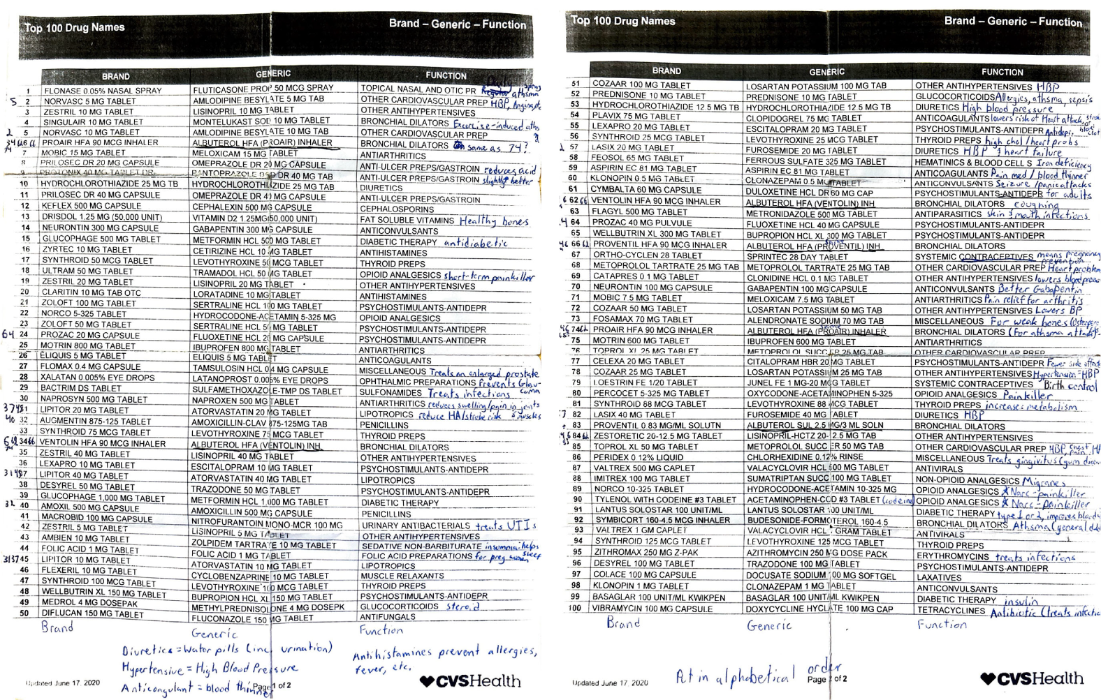
The problem with this list is that:
- The perscription you’re looking for is very hard to find.
- Most customers wouldn’t understand the “FUNCTION” description.
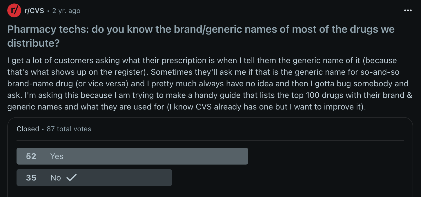
I submitted a poll to the r/CVS Reddit page to see if other pharmacy technicians had the same struggles as I did. While the user profiles are not verified, it intrigued me to see how many others didn't know both the brand & generic names of most perscriptions.
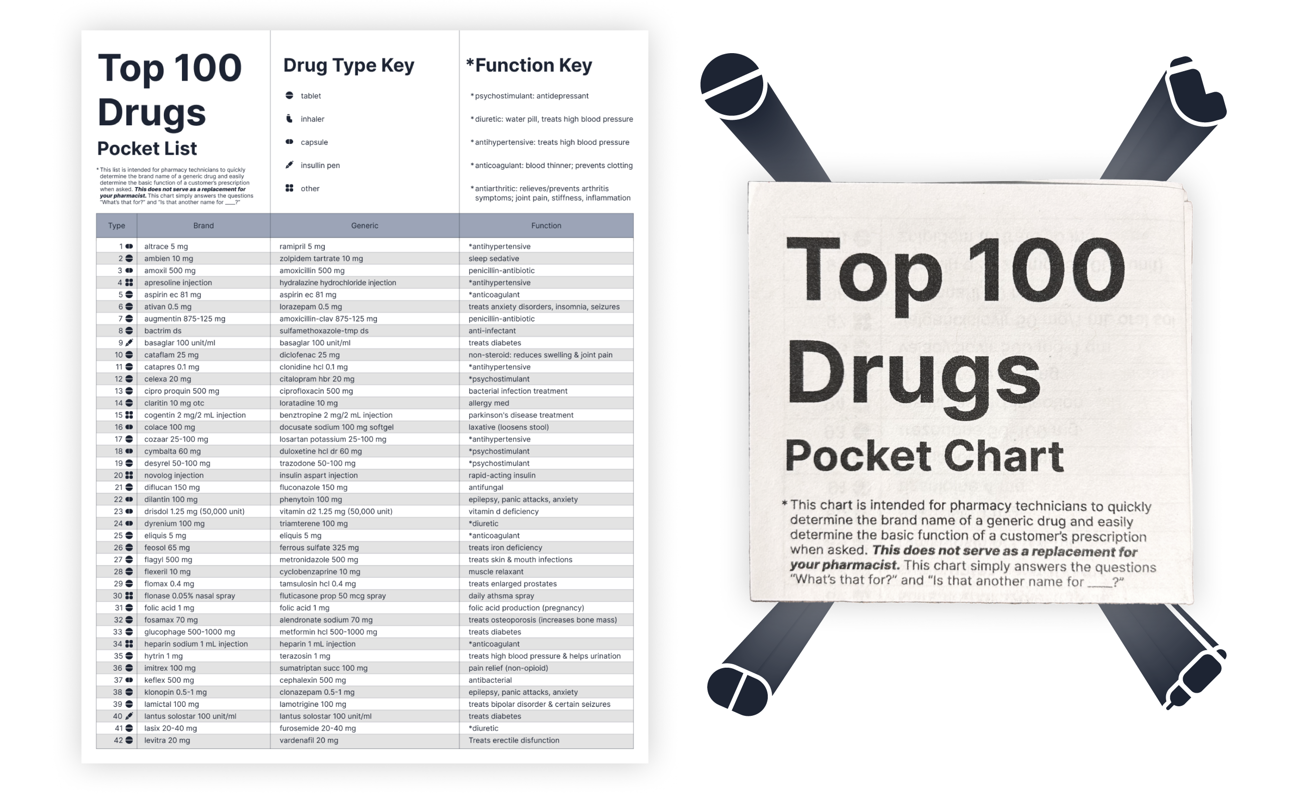
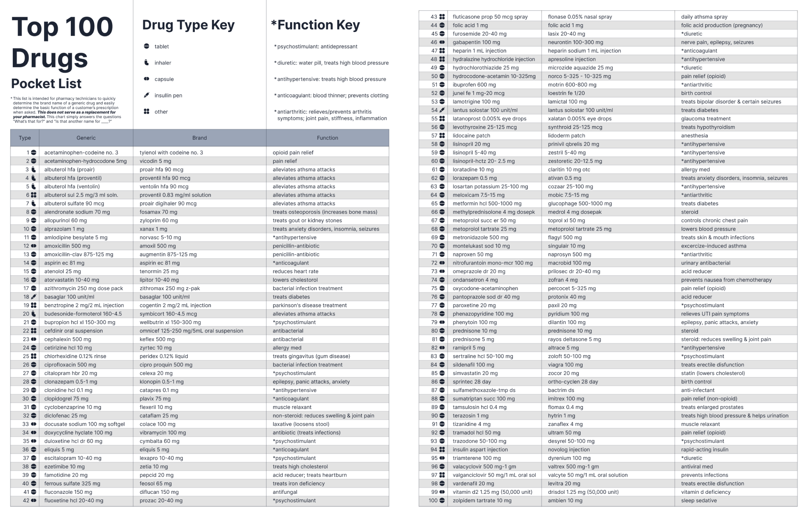
My goal:
Redesign CVS's list to be quickly & easily scannable in order to help customers very quickly.
How I made it
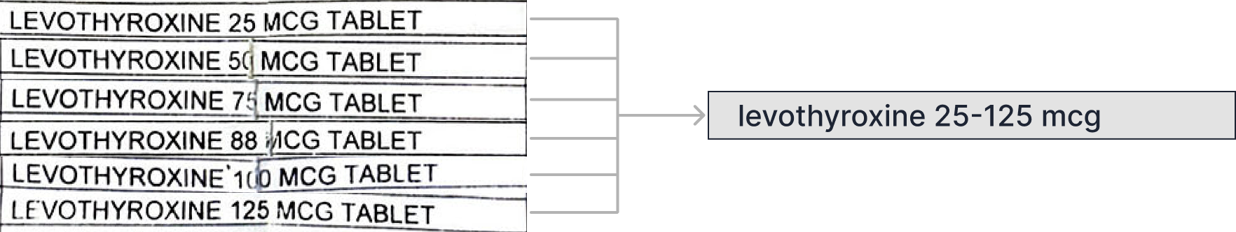
1. Alphabetical order & consilidating duplicates
I noticed there were duplicate drugs of varying strengths. Being that they all had the same function, I condensed the duplicates to one row.
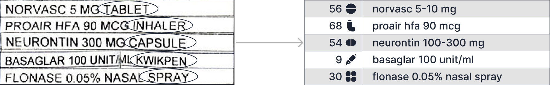
2. Used icons to indicate drug types
Next, I noticed that the prescription names would be followed by “TAB”, “CAP”, “SOLN” or something to indicate the drug type. This was redundant, not scannable, and took up precious space, so I replaced that the with icons instead.
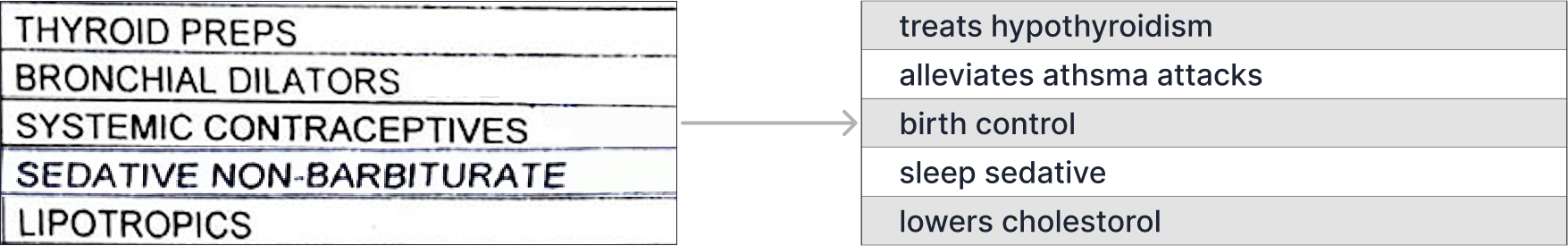
3. Simplified the "FUNCTION" description
Then, I noticed a lot of drugs had the same “FUNCTION” description. Their descriptions were either too vague or too pharmaceutical for most customers to understand so I rephrased them in a more digestible way.
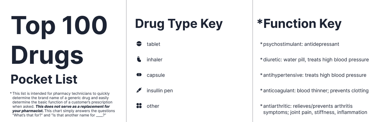
I included a title with a disclaimer that this chart is NOT meant to replace your pharmacist. I also included a key for the drug type icons and the function key to define recurring pharmaceutical words that I decided to keep from the CVS list since they came up so frequently.
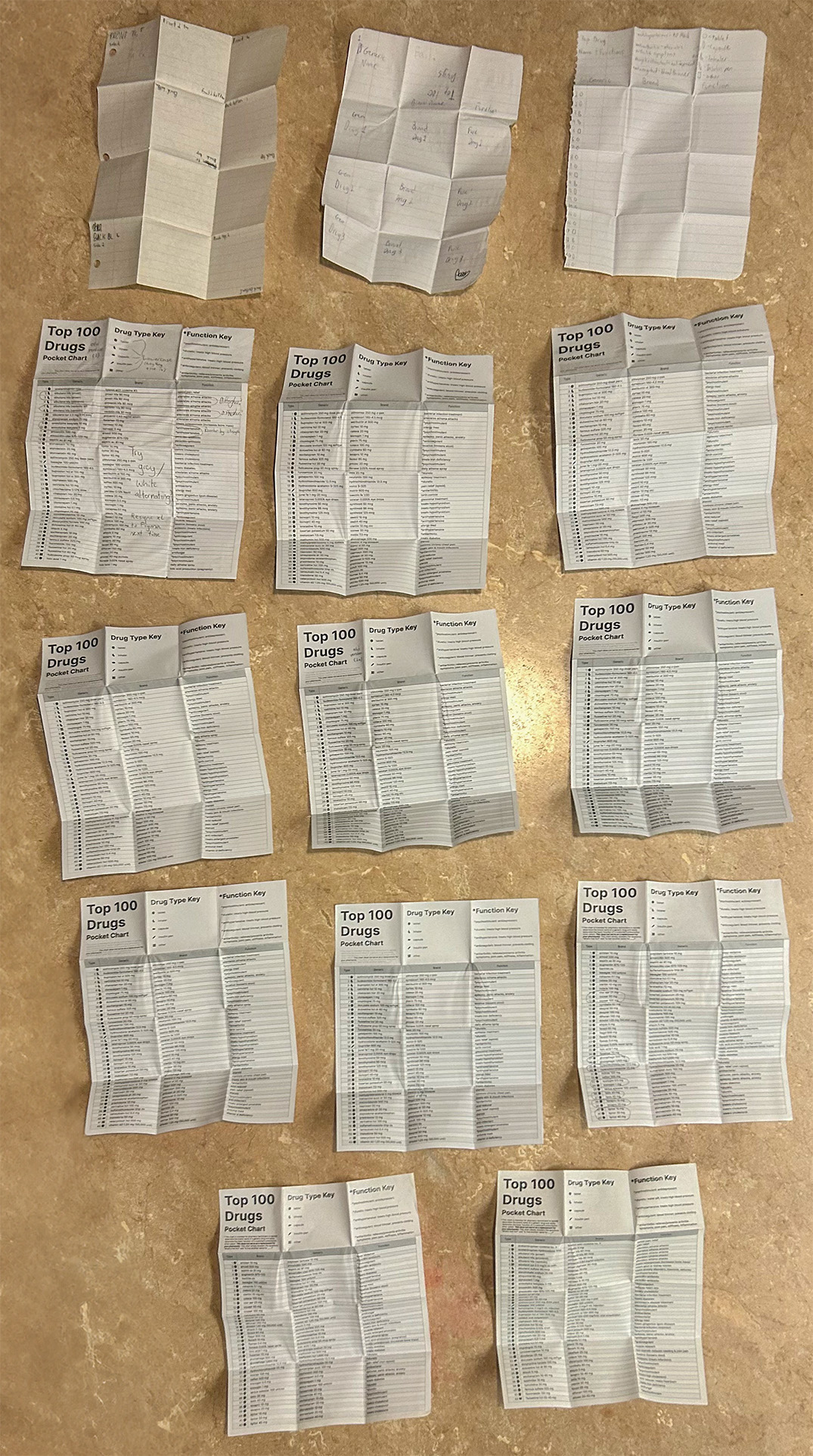
Print iterations
I created 14 different versions of my design before it was finalized- starting with looseleaf paper to figure out the way the paper should be folded.
Final Designs
Final designs were reviewed & verified by my pharmacist to ensure its quality.
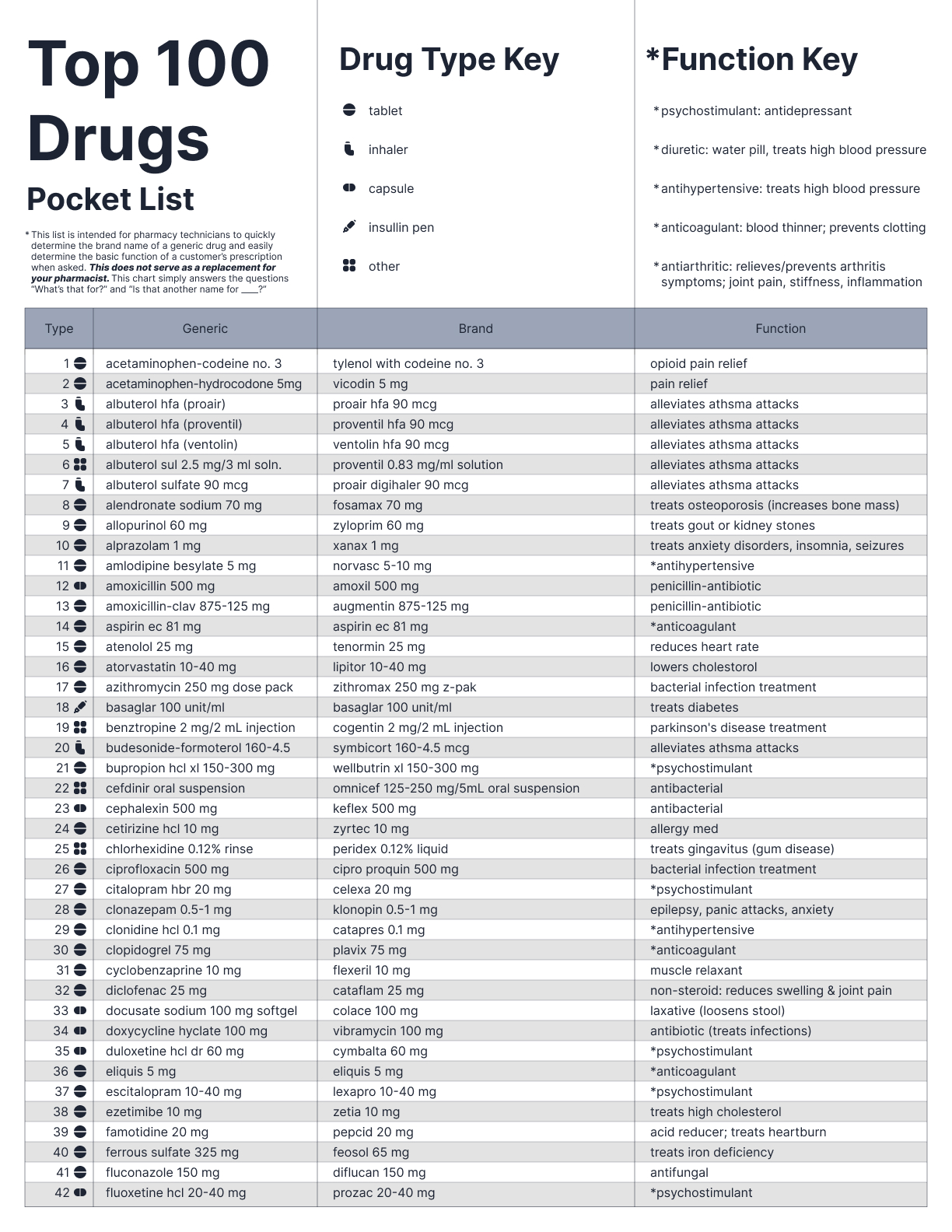
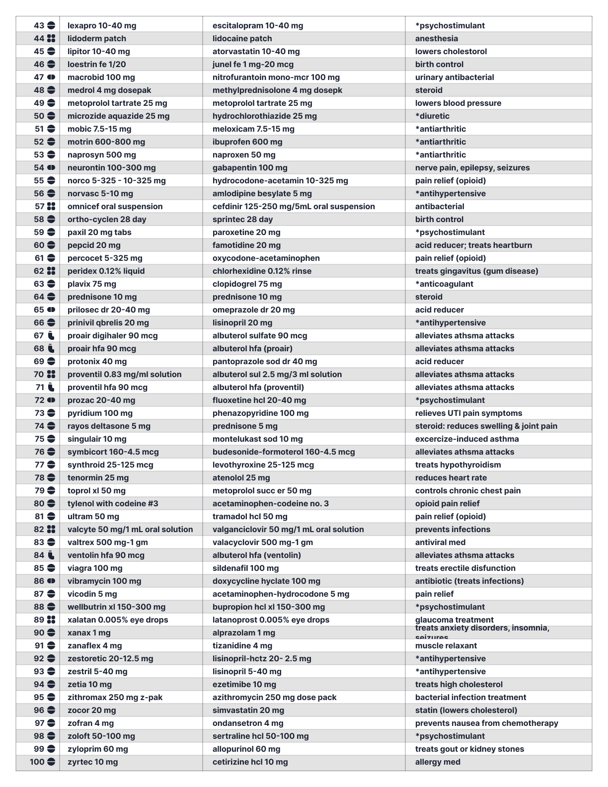
Redesigned list- alphabetical by generic name
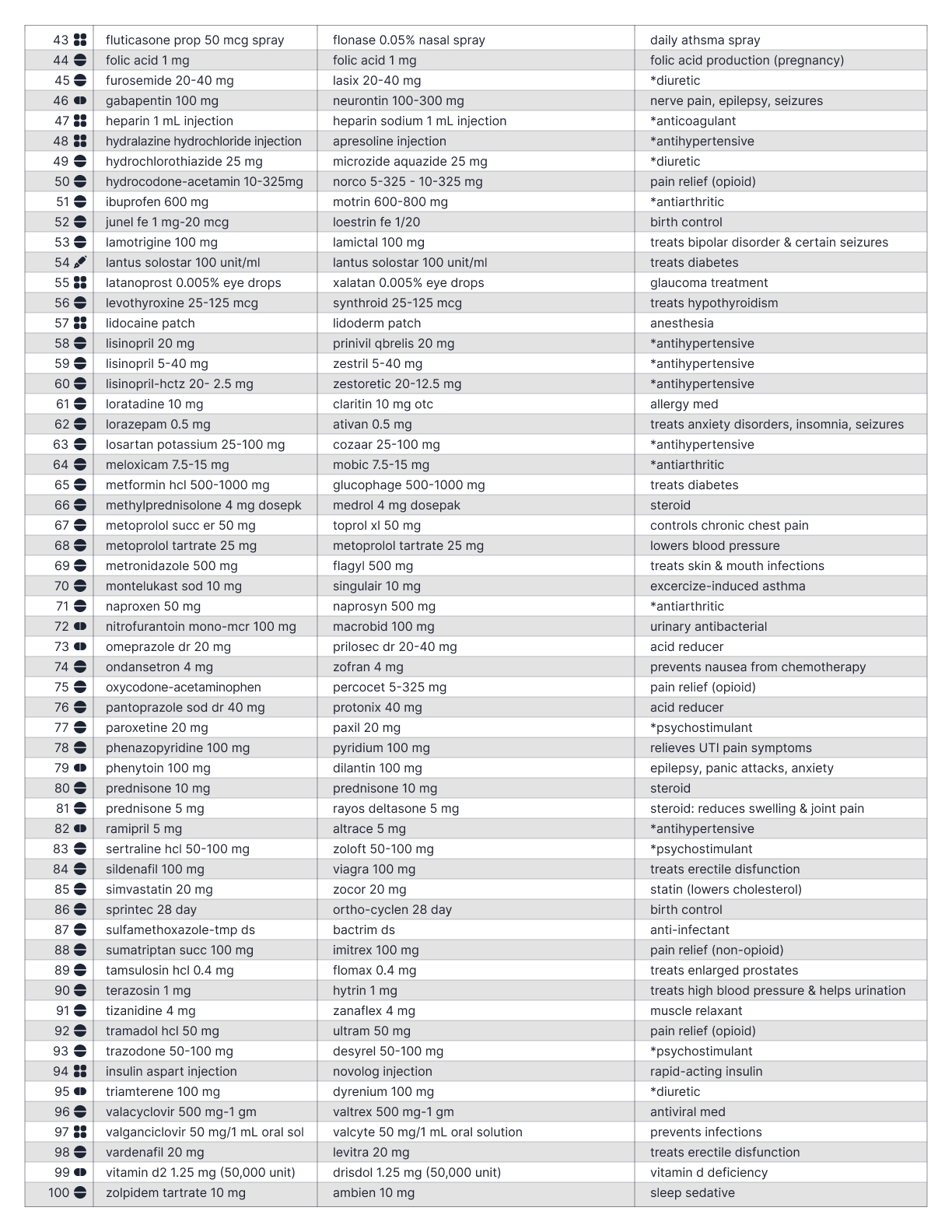
Redesigned list- alphabetical by brand name
Folding tutorial
Summary
Easy access. Ultra scannable.
Ultra helpful!
Not only can the redesigned list tell you the function of the top 100 most common CVS perscriptions within 10 seconds, but it also is a great study tool to memorize which perscriptions do what. This design resulted in daily time saved by myself and my pharmacists. Download & print a copy now to save lives during an apocalypse.
Explore More Creations ↓

© 2026 John Curley Design
